Introduction
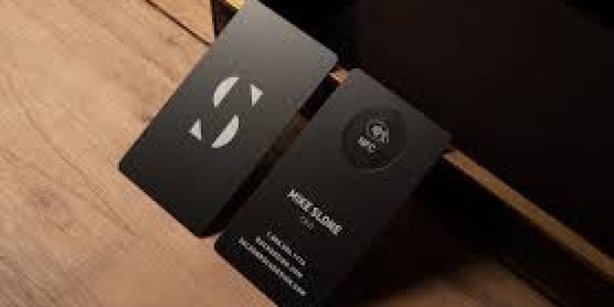
In today's fast-paced, tech-driven world, first impressions happen in seconds. That’s why NFC business cards are becoming increasingly popular—they offer a seamless way to share contact details with just a tap. But here’s the thing: the NFC card is only the beginning. What truly makes the connection stick is the smart landing page it leads to. Think of it as your digital handshake, portfolio, and elevator pitch—all wrapped into one sleek experience.
Whether you’re a freelancer, a small business owner, or part of a growing enterprise, your NFC card's landing page can either convert interest into action or leave people unimpressed. So, setting up this page properly isn’t just a nice touch—it’s essential.
Why a Smart Landing Page is Crucial
When someone taps your NFC business card, they’re likely in a hurry or curious to know more about you. A well-designed landing page meets them halfway. It gives just enough information to intrigue, just enough clarity to inform, and just enough value to encourage action.
Unlike traditional business cards, which often get lost or tossed, an NFC-triggered landing page stays digital and dynamic. You can update it anytime without printing a new card. Plus, it lets you guide the viewer exactly where you want them to go—be it your portfolio, LinkedIn, booking form, or contact number.
But none of that matters if the landing page isn’t thoughtfully designed. A generic, cluttered, or confusing page might lead to lost opportunities. That’s why a smart approach to setting it up matters more than ever.
Understanding the User Experience
Before you dive into building your landing page, take a moment to think like your visitor. Imagine they’ve just tapped your NFC card at a networking event. They don’t have time for fluff. They want clarity, professionalism, and relevance.
The best landing pages guide users smoothly from curiosity to action. This means everything on your page—from colors to fonts to copy—should work together to deliver a frictionless experience. If your visitor has to zoom in, scroll endlessly, or guess where to click, you’ve already lost them.
Your goal should be to anticipate their needs and address them within the first few seconds. What do you do? How can you help them? How can they reach you? Answer these questions clearly, and you’ll already be ahead of the game.
Choosing the Right Platform
There are many platforms that can help you build a smart landing page without needing to write a single line of code. Think of tools like Carrd, Linktree, Notion, or custom WordPress pages. Your choice will depend on how much control you want over the design, your budget, and your comfort with technology.
If you’re looking for speed and simplicity, Carrd is a great option—it’s lightweight, mobile-friendly, and affordable. If you want deeper integrations and analytics, consider a CMS like WordPress or a no-code builder like Webflow.
The key is to choose a platform that fits your goals. A minimalistic link-in-bio page might be enough for some, while others may prefer a full-blown personal website. Whatever you pick, make sure it’s responsive, reliable, and lets you easily update content.
Creating a Clear and Impactful Headline
The headline is the first thing your visitor will see. So make it count. It should quickly communicate who you are and what you do. If possible, also hint at what value you bring to the table.
Avoid buzzwords or generic labels. Instead, be specific. A headline like “Helping Brands Grow Through Strategic Content Marketing” says more than just “Marketing Consultant.” Clarity beats cleverness every time when it comes to digital communication.
Also, make sure your headline is easy to read on mobile screens. Use a large, legible font and give it breathing room with plenty of white space around it. First impressions matter—and this is your digital handshake.
Adding a Personal Touch with Visuals
People remember faces more than names. Including a high-quality photo of yourself builds trust instantly. If you're not comfortable using a personal photo, a professional logo works too—but make sure it looks sharp and clean.
Beyond your photo, consider adding visuals that reflect your brand. This could be a short intro video, a photo gallery of your work, or custom graphics that illustrate your services. Just be careful not to overdo it. Every image should serve a purpose and support your message.
The idea is to create a page that feels human and approachable, not robotic or overly formal. The visuals should complement the content, not overwhelm it.
Structuring the Page for Easy Navigation
Visitors should be able to find what they’re looking for in a few seconds. That’s why it’s important to structure your page with clear, well-spaced sections. A smart flow could include your introduction, services, portfolio, testimonials, and contact details.
Each section should feel like a natural continuation of the previous one. Use headings and subheadings to break up the content and guide the eye. Keep your paragraphs short and digestible, especially for mobile viewers.
Navigation should be intuitive, even if your page is just one scrolling view. Think of the entire experience like telling a story—one that leads to a satisfying conclusion where the viewer knows exactly how to take the next step.
Integrating Contact Options and Social Proof
Your landing page should make it incredibly easy for someone to reach out. Include a clickable phone number, email address, and maybe even a short contact form. If you’re active on social media, link to those profiles too.
Don’t forget the power of social proof. Including testimonials, client logos, or links to your work builds credibility. Even a simple quote from a satisfied client can make a difference.
The goal is to build trust quickly and show that others have benefited from connecting with you. This reassurance often nudges hesitant visitors into taking action—whether that’s sending a message, scheduling a call, or checking out your services.
Optimizing for Mobile View
Since most people will tap your NFC card with a phone, your landing page must look great on mobile. This means more than just shrinking everything to fit a smaller screen. It means designing for mobile first.
Large buttons, legible text, and fast load times are all critical. Avoid pop-ups or overly complex elements that don’t work well on touch screens. Make sure your images scale correctly and that there’s no awkward scrolling or broken layouts.
Test your page on different devices and browsers to catch any issues. A page that works beautifully on desktop but fails on mobile could lose you valuable connections in seconds.
Ensuring Fast Loading Speed
Nobody waits around for a slow page to load. Even a few seconds of delay can lead to frustration—and lost opportunities. That’s why page speed is one of the most important aspects of your NFC landing experience.
To ensure quick load times, compress your images, avoid unnecessary animations, and limit the number of third-party scripts. If your platform offers built-in performance tools, use them to monitor and improve speed.
Every tap on your NFC card should lead to a fast, fluid experience. The quicker your page loads, the more likely it is that the visitor will engage with your content.
Tracking Engagement and Analytics
You’ve built the page—great. But how do you know if it’s working? That’s where tracking comes in. Tools like Google Analytics or native analytics from your landing page builder can show you who’s visiting, what they’re clicking, and how long they’re staying.
This information is gold. It helps you refine your layout, tweak your messaging, and test new ideas. For instance, if people aren’t clicking your contact button, maybe it needs to be bigger or placed higher on the page.
Tracking also shows your progress over time. As your network grows and your card gets more taps, you’ll start to see patterns that can inform better decisions—not just for your landing page, but for your entire brand strategy.
Final Thoughts
Setting up a smart landing page for your Digital Business Cards isn’t just about looking good—it’s about communicating clearly, building trust, and converting curiosity into connection. In just a few seconds, you have the chance to show someone who you are and why they should care.
With the right strategy, tools, and a bit of creativity, your landing page can become a powerful asset that works for you 24/7. So take the time to make it shine. Test it, tweak it, and treat it like your digital storefront.
Because in a world of short attention spans and fast interactions, a smart landing page might just be your most important business tool.


